CASE STUDY
O, The Oprah Magazine 2018 Brand Redesign
While at O, Tova and the design team were tasked with a brand redesign for its audience of 10 million. The purpose of which was twofold: refresh and modernize the brand style guide to resonate with both the brand’s rapidly growing millennial following and its existing devoted audience.
With this in mind, and under the guidance of Design Director Jill Armus, Tova and team created an elegant, energizing and authoritative visual direction–using a modernized color palette, dynamic page navigation, graphic photography and fresh typefaces.
PHOTO-DRIVEN SECTION OPENERS
Previously, section openers of the print magazine included colorblock banners at the page border and other decorative design elements protruding on the photography. Here, those elements were stripped away and replaced with restrained typography that best showed off the elegant boldness of the Quase typeface paired with more dynamic page navigation and full-bleed imagery for more visual impact. The addition of the “O” logo at top left also helped to inject more brand identity and a queue to the start of each section.
Note: Images used in the samples below were not published in this context and used for the purpose of mockups and reference only.


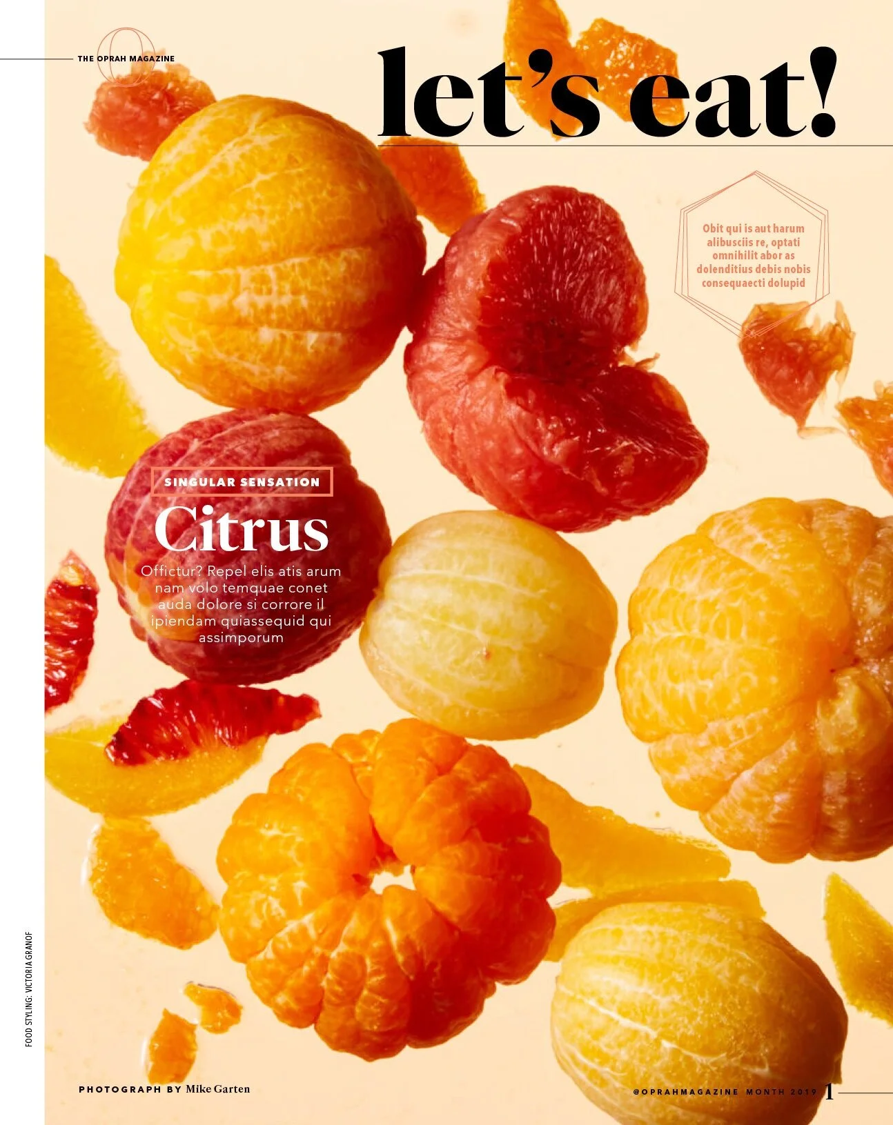


“LET’S EAT!” FOOD SECTION
With the redesign of the “Let’s Eat” section, Tova’s aim was to create more visual distinction and clarity between the various edit franchises allow for a mix of photography styles: graphic, dynamic still life on the openers, pickup or provided photography, and full-bleed colorful environmental tablescape shots. The freehand, washy ink illustrations also work to unify the section and offer a needed human element to the section.


ADDITIONAL PRINT SAMPLES
A few more published executions of this brand redesign from various issues in early 2019.


DIGITAL PLATFORMS
Oprahmag.com with its 7.8 million unique visitors, in addition to its social media channels, also adopted the new brand style guide.


ADDITIONAL CREDITS
Design Director: Jill Armus, Art Director: Alexandra Mooney, Deputy Art Director: Gillian MacLeod